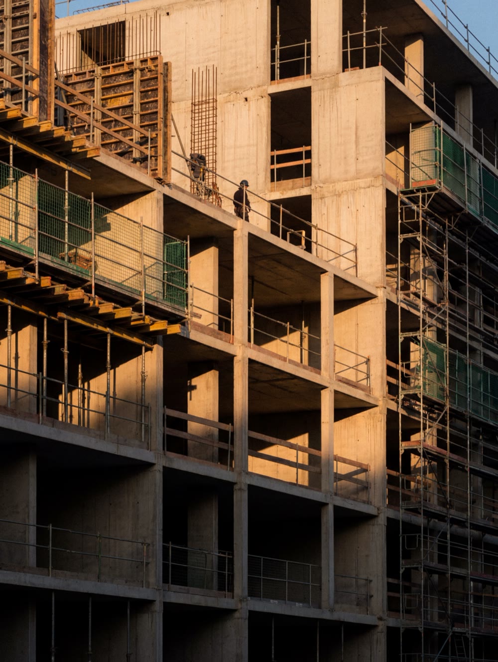
STEQ, formerly NX Real Estate, makes investing in Dutch real estate accessible to people who can’t buy a whole building. We developed the brand strategy, identity and guidelines, designed the investor platform and built the website.
- ClientSTEQ
- IndustryReal Estate
- Period2026
- RoleFull engagement
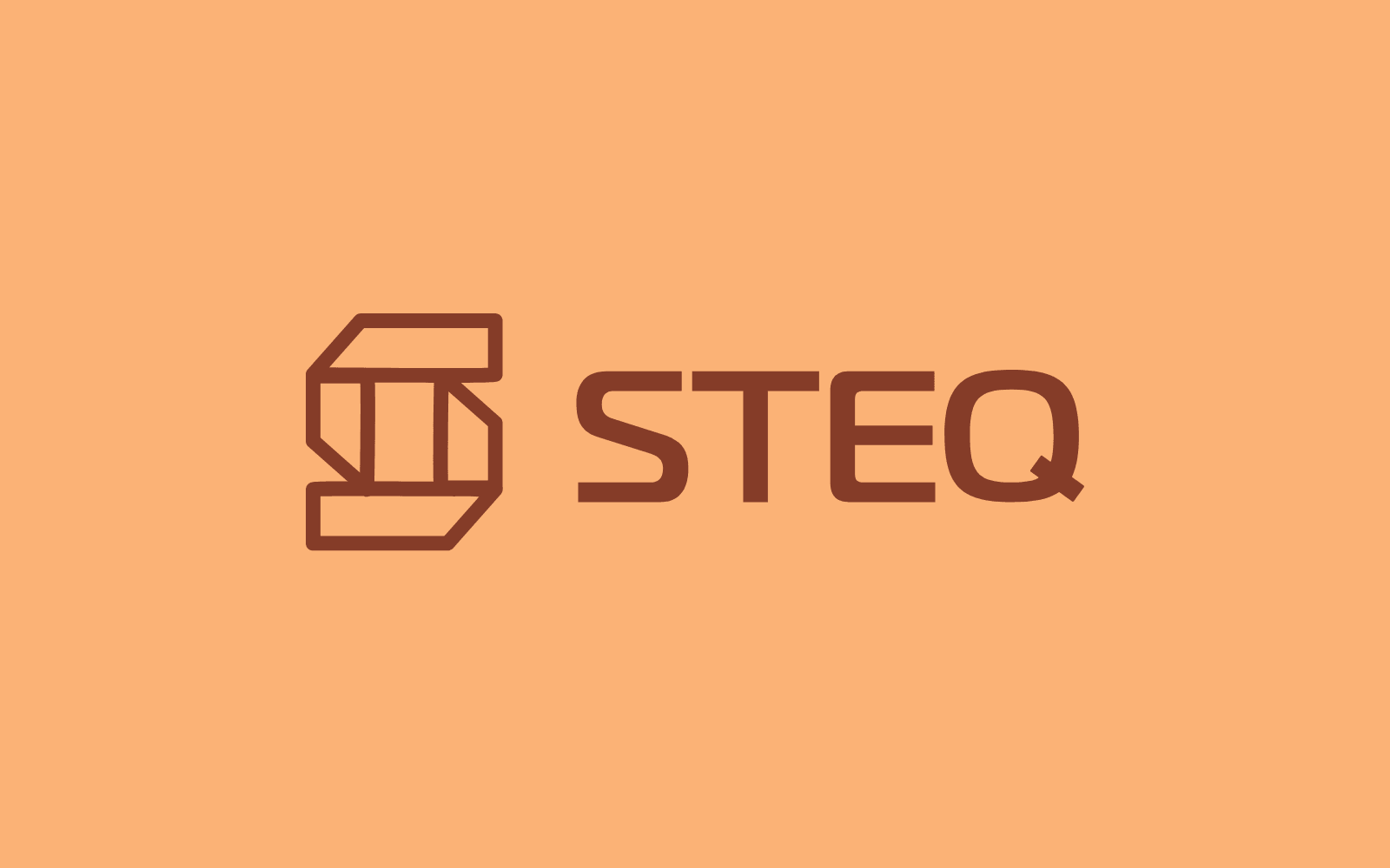

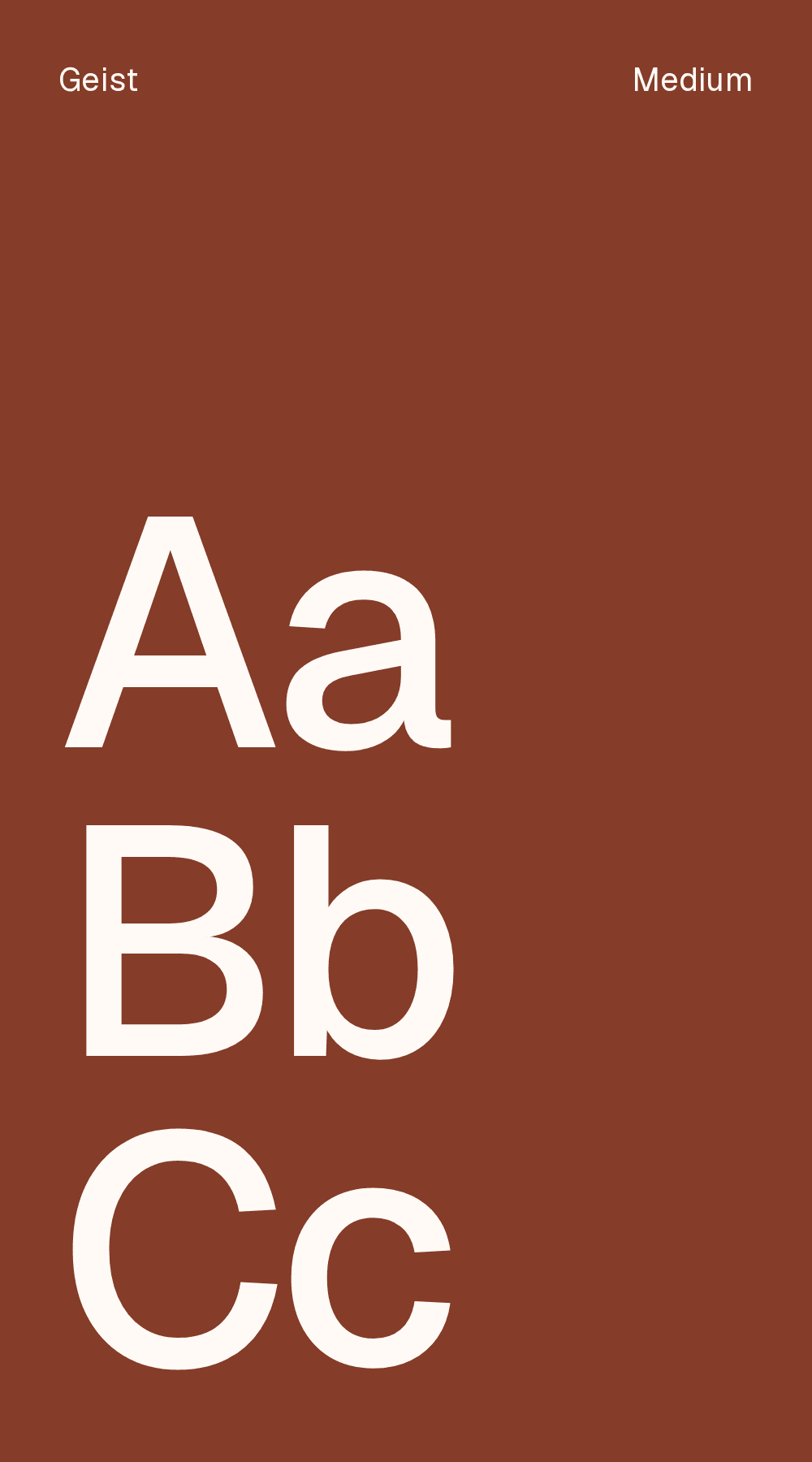
We positioned STEQ as a Reliable Modernist: contemporary in access and execution, solid in everything that involves money. From that position we designed the brand, the website and the investor platform.

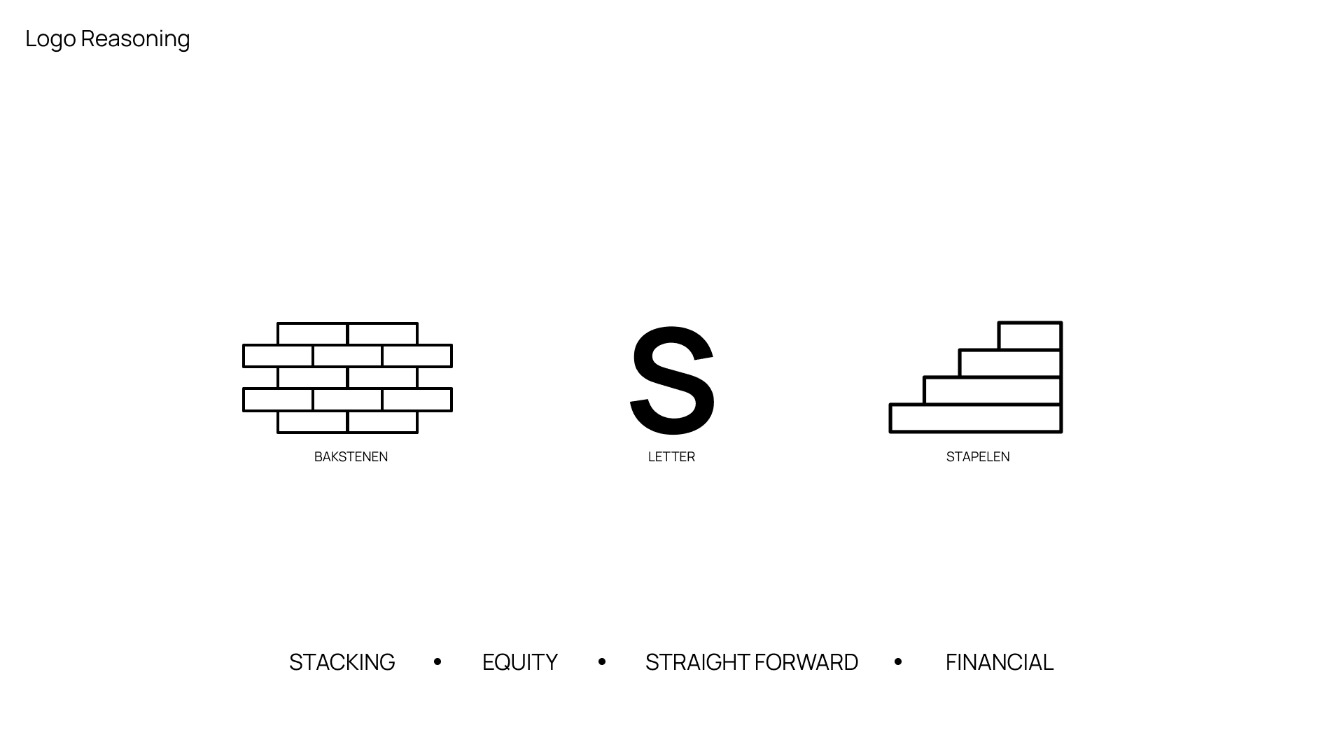
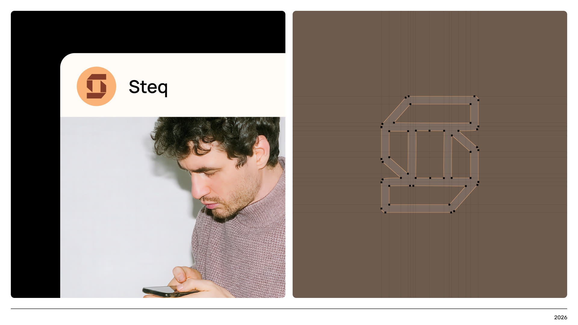
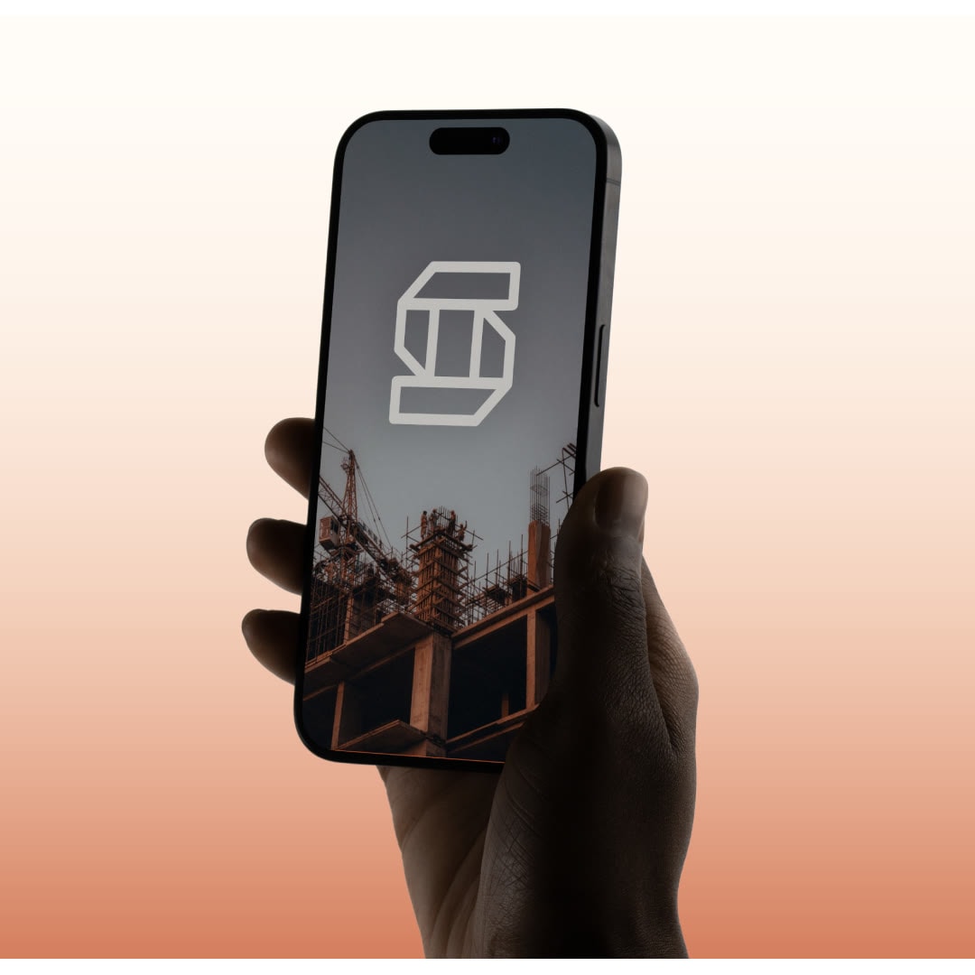
The Dutch brick became the starting point. The mark is an S built from bricks, and every colour is named after a building material, from Brick and Terracotta to Limestone and Basalt. For imagery we built our own tool that stacks bricks into towers, stairs and pyramids, so new images and animations always stay within the brand.

A tool that builds the imagery, brick by brick
STEQ's imagery doesn't come from a stock library. We built our own tool for it, where you play with the colours and the build-up of the bricks: how they stack, turn and move, from which camera and in which format. It makes towers, stairs and pyramids that always stay on brand. STEQ uses the tool itself, for every new visual or animation.
The website explains in plain language how investing in real estate works. You see straight away what you buy, what you get and when: from €100, and five clicks to your first investment. Behind it sits the investor platform, where you keep track of your positions, the offerings and your documents.
Real estate has built wealth for generations, but taking part used to take serious savings. STEQ wants to change that for people who handle their savings with care and have little patience for market jargon. STEQ now has one system for how the brand looks, sounds and behaves. The guidelines live online in two versions: one for people and a brand.md for AI agents, so work made with AI stays on brand too.