
Specters Coffee had good coffee, but the brand did not yet show who it was for. We gave it an identity for people who ask a lot of their day and see coffee as part of their rhythm.
- ClientSpecters Coffee
- IndustryFood & Beverage
- Period2025
- RoleFull engagement
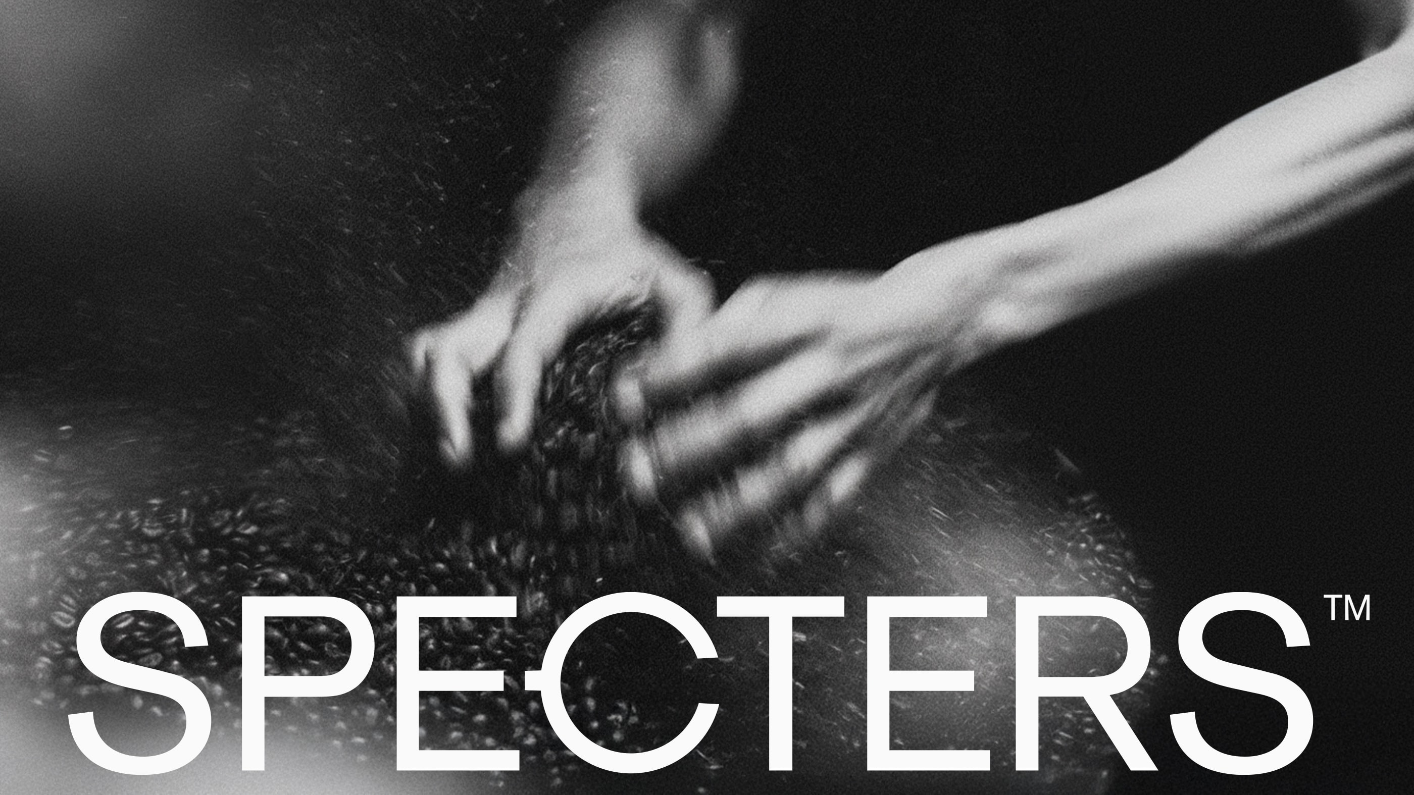
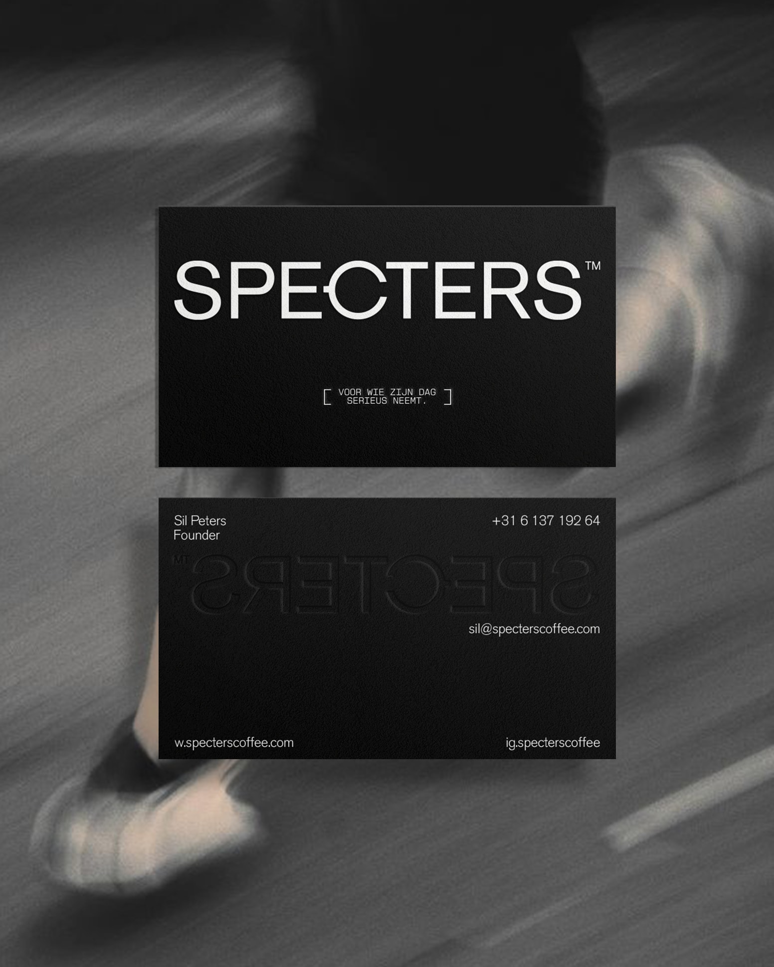
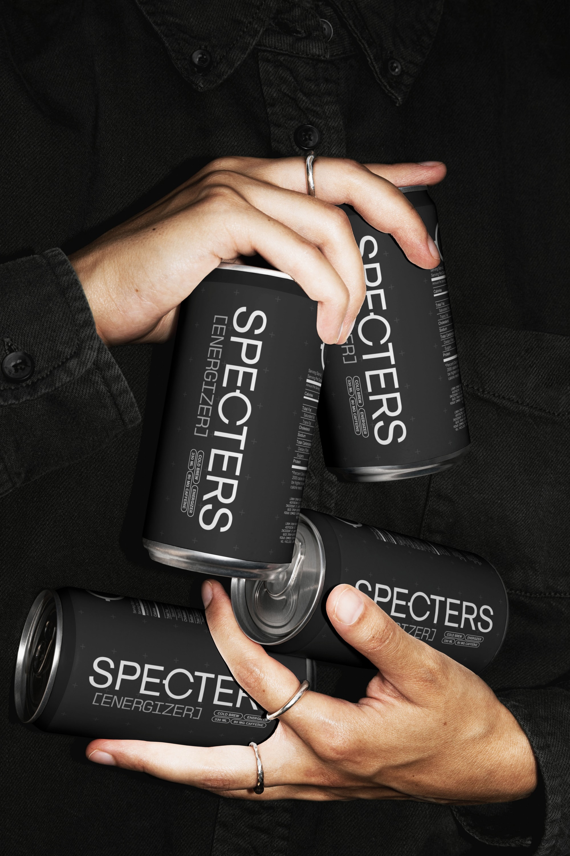
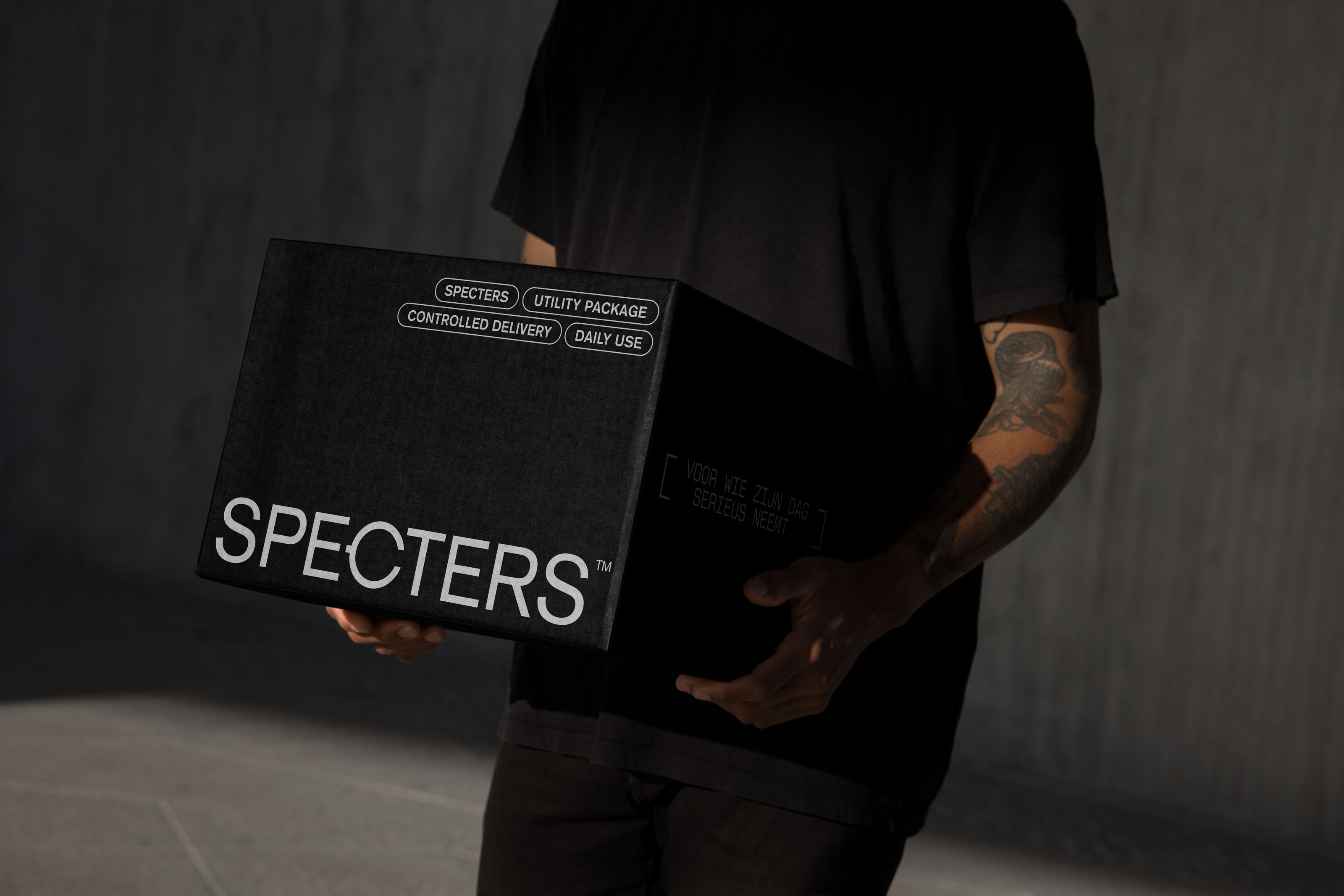
For Specters we made a new identity, from wordmark and packaging to posters and social media. We started from the working rhythm and ambitions of its customers, not the craft behind the bean. That way the coffee feels like a natural part of the day.
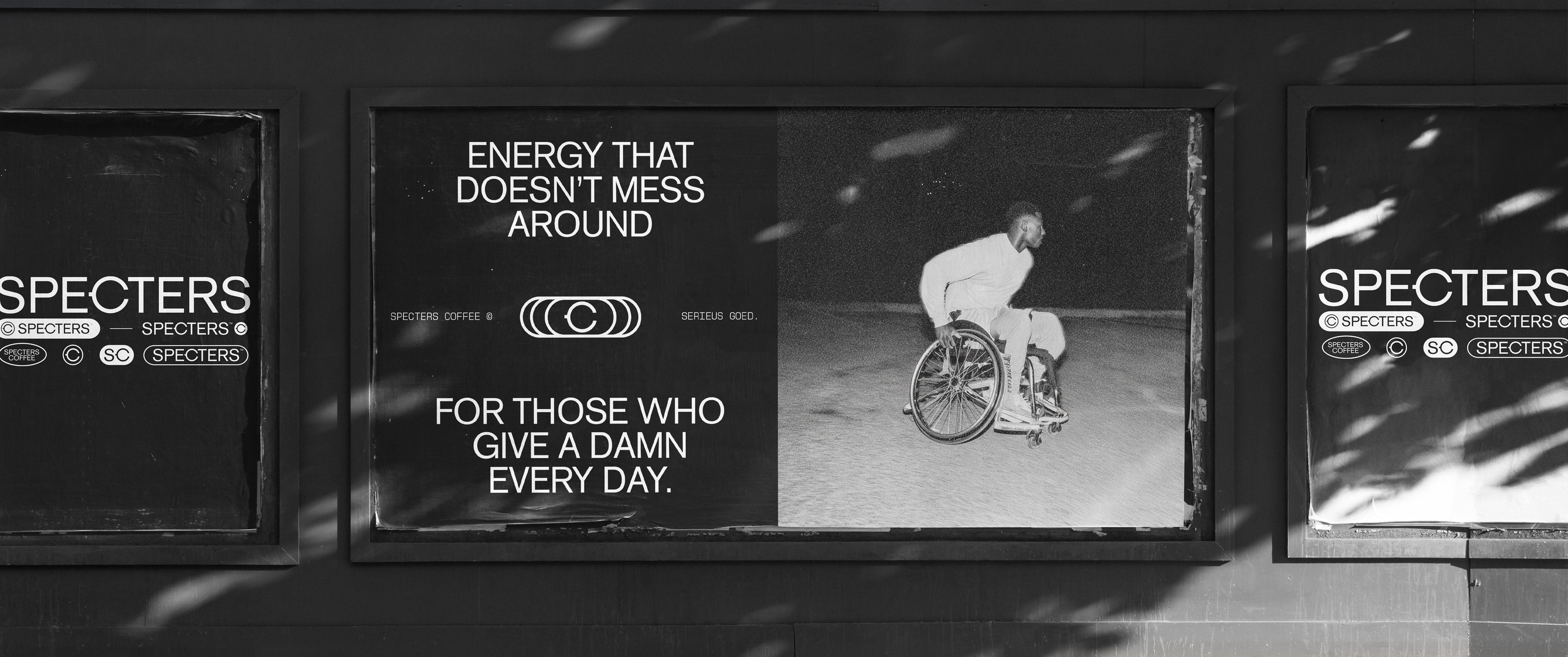
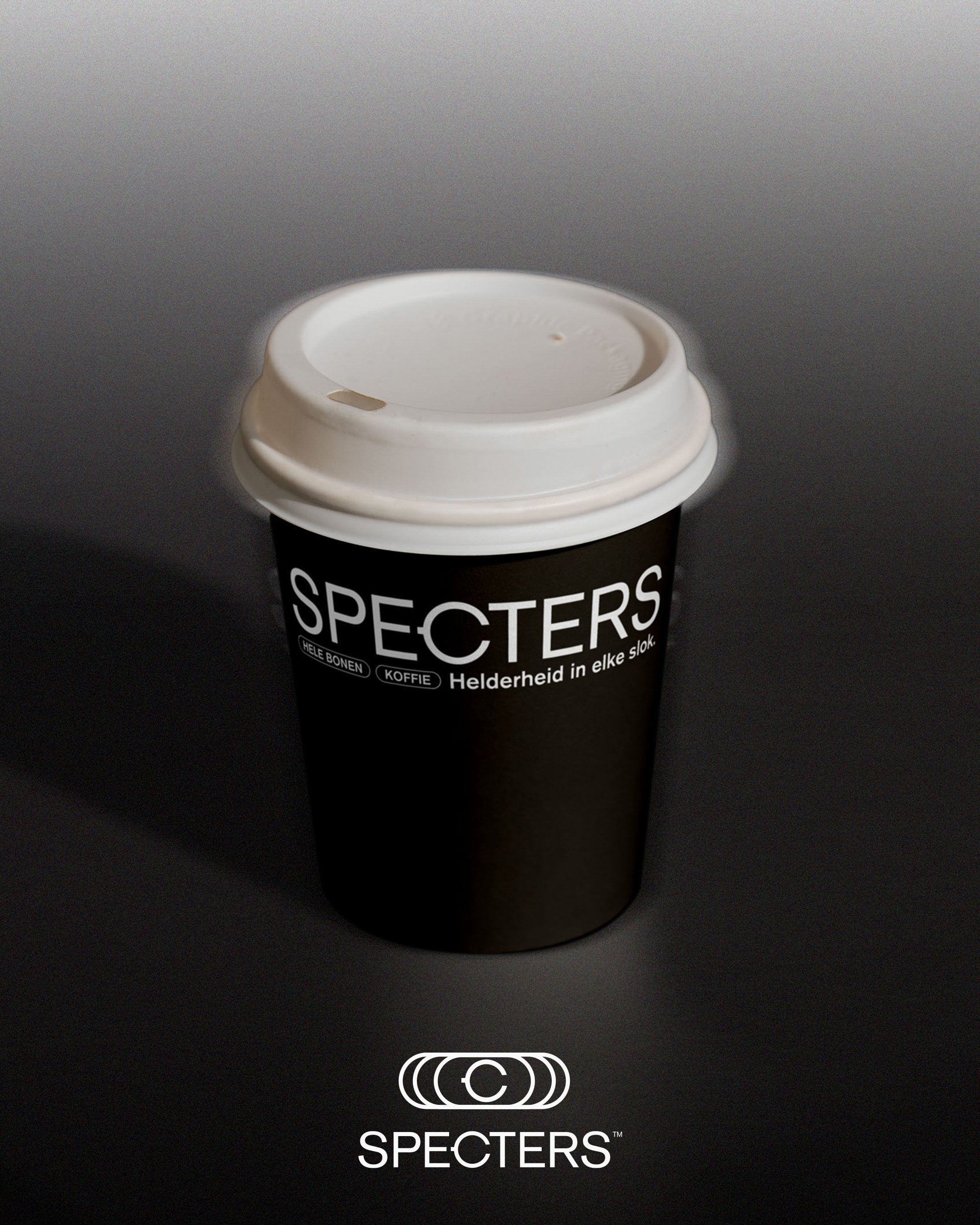

Coffee branding often starts with brown bags and stories about craft. We chose bold lettering and clear packaging, which gives Specters its own face among other coffee brands. The design feels more at home on a desk than on a rustic kitchen table. Before you read a word, the pack tells you something about who the coffee is for.
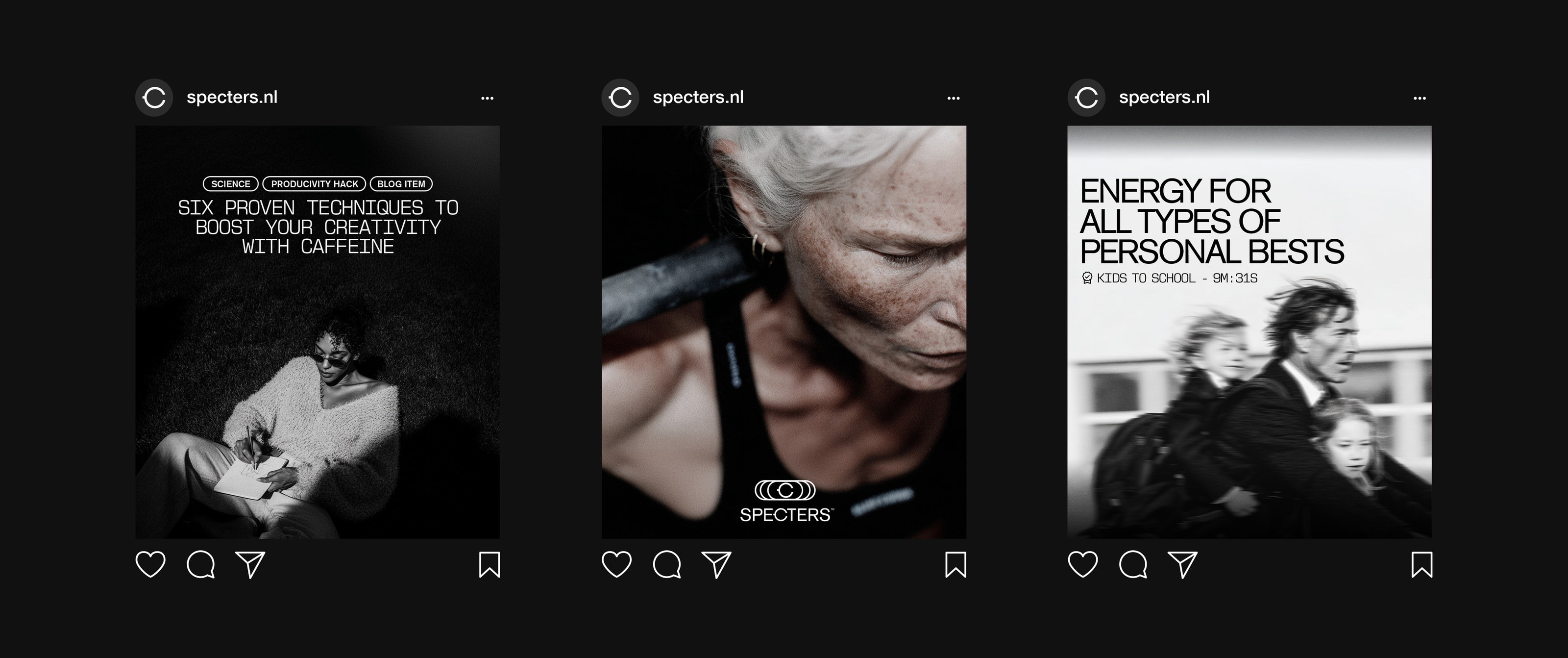
The coffee was good, but the old identity gave people little reason to choose Specters. The new brand makes that choice more personal, because you recognise your own ambition and daily rhythm in it. That gives the product a story that reaches beyond price. After the rebrand: +87% monthly revenue and +31% average order value.